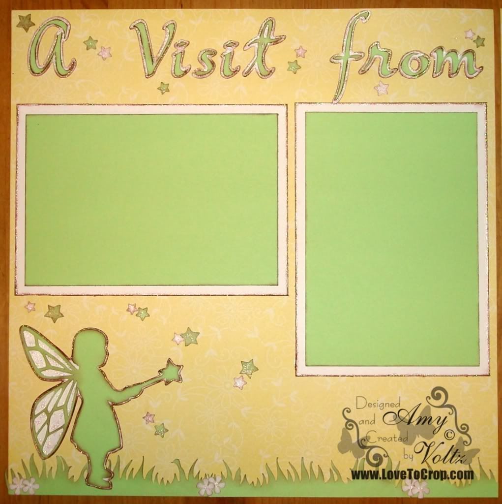
Lasting Memories Layout Challenges had a Green and White Challenge this week... You could use other colors in your layout as long as the MAIN colors were green and white... I had originally created this layout for the challenge, but then decided it wasn't green and white 'enough'...
So I created this layout too... Definitely green and white enough... :)
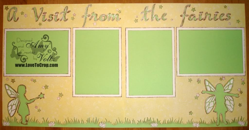
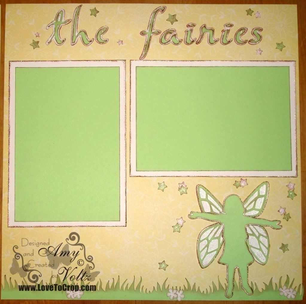
I was delighted to discover that over at Paper Cutz this week's challenge was 'YOUR CHOICE'!! Participants in Challenge #83 can create a card, LO or craft project using any colors and any theme!! So I'm happy to enter my 'A Visit from the fairies' layout in the challenge there...
This two-page 12x12 layout was created especially for my very inspirational and imaginative mom... I sometimes think if I had to choose a famous celebrity that my mom most reminded me of, it would be Shirley Temple... Aside from the fact that my mom is the most adorable mom ever, she has the same optimistic outlook and friendly demeanor of my favorite dimple-cheeked child star -- When my mom tells certain stories from her childhood, it's not hard to realize why she's as sweet, creative, and wonderful as she is now. One of my favorite stories to hear (and one of her favorites to tell) is about the fairies...
My mom's neighbor (her 'aunt') would tell her about the fairies who lived under the shrubs... Each morning they would come out from under the shrubs to collect the morning dew to make tea in a miniature tea set ( a tea set just like the one my mom had)... Together, my mom and her aunt would also make fairy tea...
Even today, my mom enjoys the spring season most of all -- She spends hours in her gardens creating the most beautiful scenery for the fairies... And you'll still find a miniature tea set (or two) tucked away on a shelf at her house now...
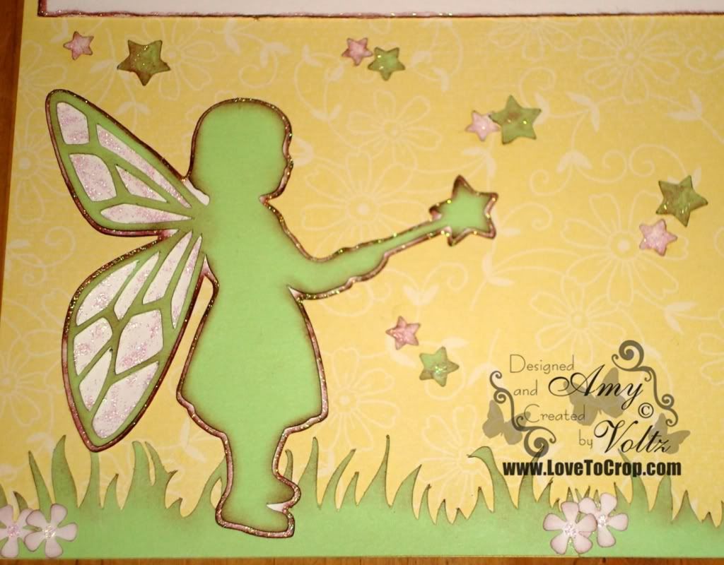
This little fairy is cut from A Child's Year Cricut Cartridge at 4". I've seen pictures of my mom as a little girl, and this is exactly what I envision her silhouette to look like when I think of the fairy story...
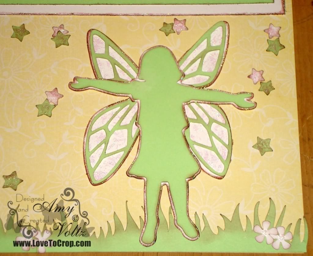
The fairy on the right page is actually the little girl with the hula hoop on the A Child's Year cartridge -- I removed the hula hoop and added two of the fairy wings from the other image (cut the fairy child image twice, flipping one to have a full set of wings)... I just loved how she was holding her arms out as if to catch the dew drops (and stars)...
The font for the title is from the Jasmine Cricut Cartridge... I cut both the base image and the shadow image at 2.5". This is a very flowing font, so it's important to cut a sample of a few of the letters you want to use before making your final cuts -- The sizing can be very different from what you're expecting!! :)
My background paper for this layout is from Creative Memories Delight Power Palette. The cardstock colors I used are White and Honeydew. Additional products used include brown chalking inks, CM's Stardust Maker, CM's Meadow Maker, and the new CM Paper Edger...
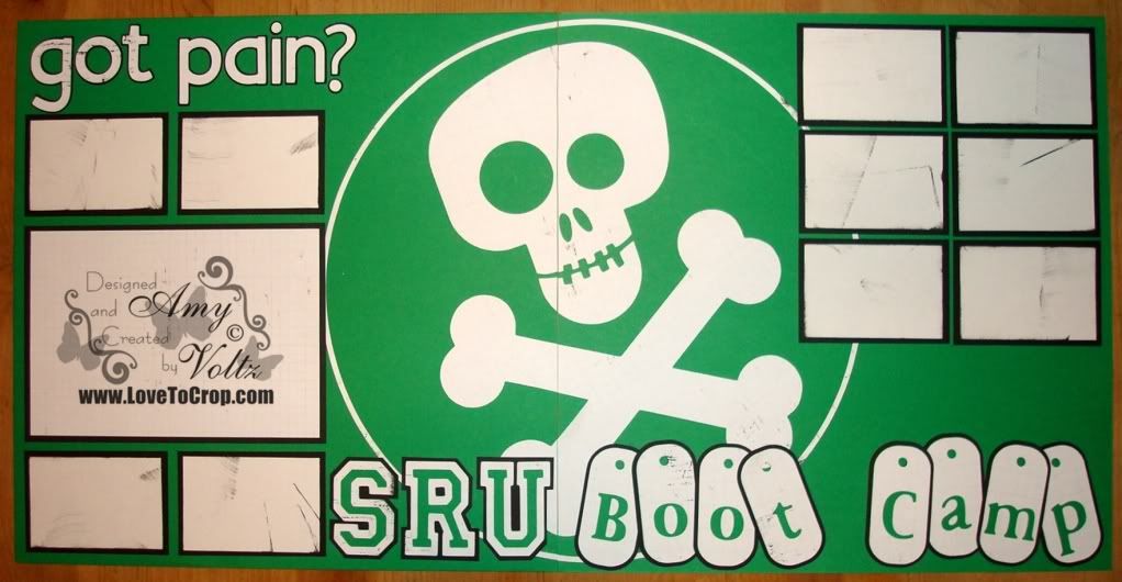
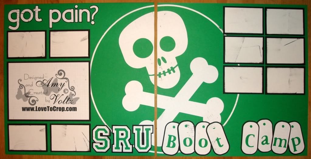
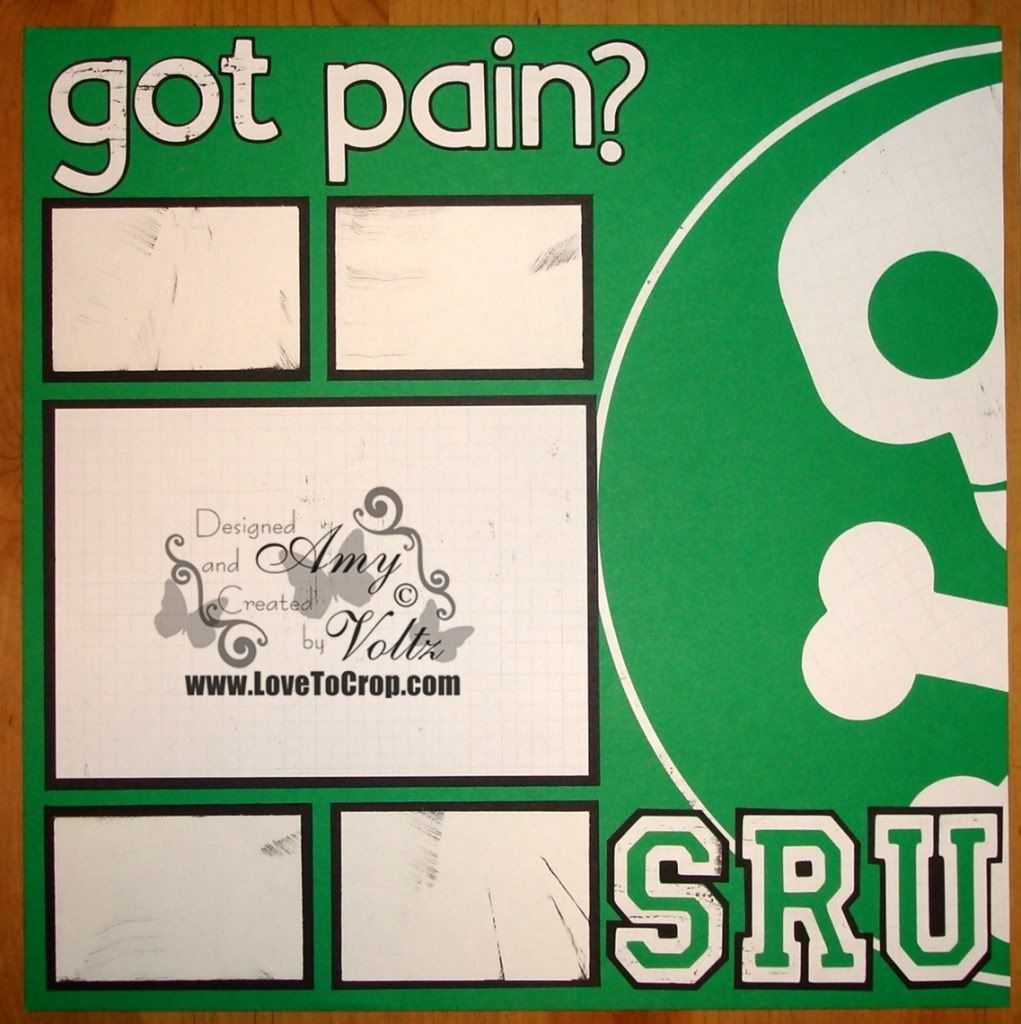
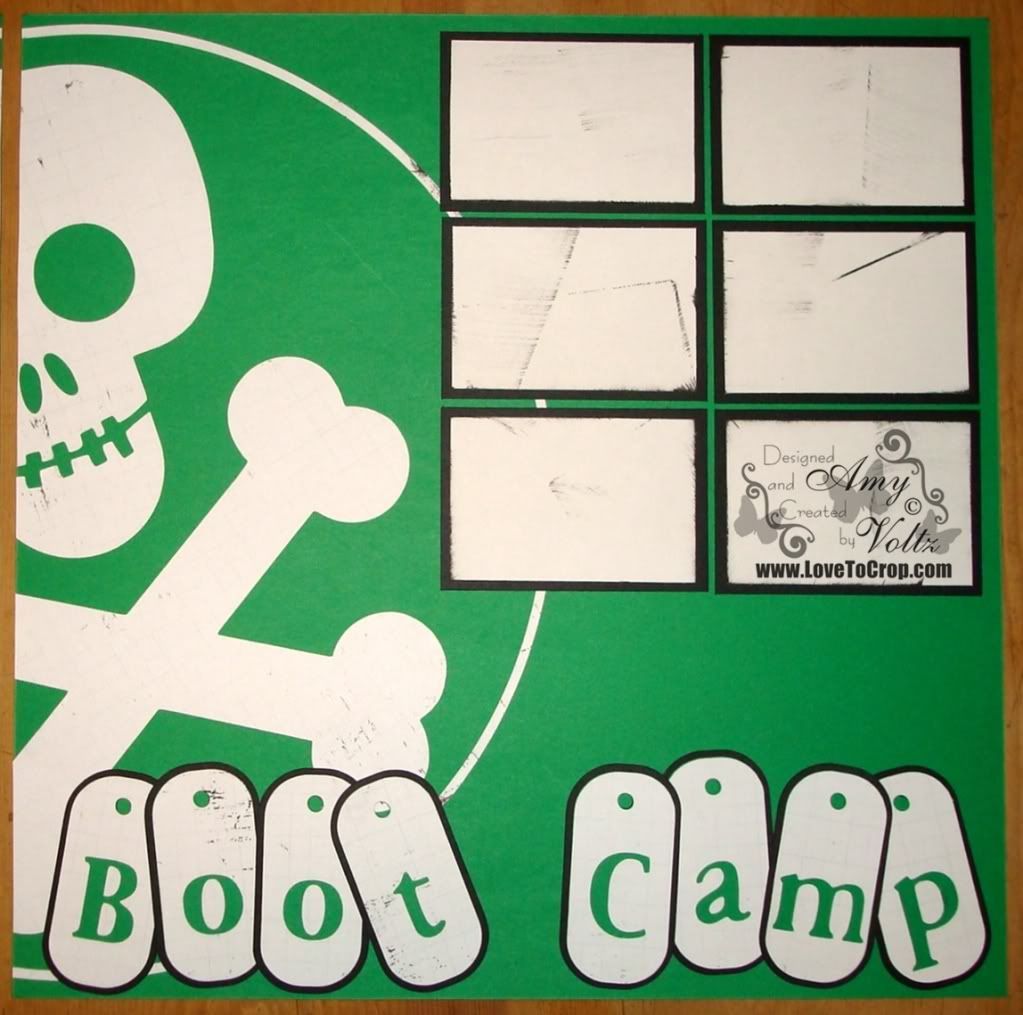
For my second layout, I used some of the distressed white paper from the Black and White Power Palette and Black and Green cardstock.
This two-page 12x12 layout is designed to hold one horizontal 4x6 photo as well as TEN 2x3 photos (printed as '4 on a page' 4x6 photos)... Since the boot camp class is held in the university's gym, the lighting isn't always the best -- So these small photos allow a showcase of more events without a huge amount of attention to detail in the photos...
The class 'theme' is "got pain?" so I felt that was a pretty appropriate title (and the answer is, YES! -- This class is definitely NOT without pain -- LOL)... The font used for this title was from the Sans Serif Cricut Solutions Cartridge.
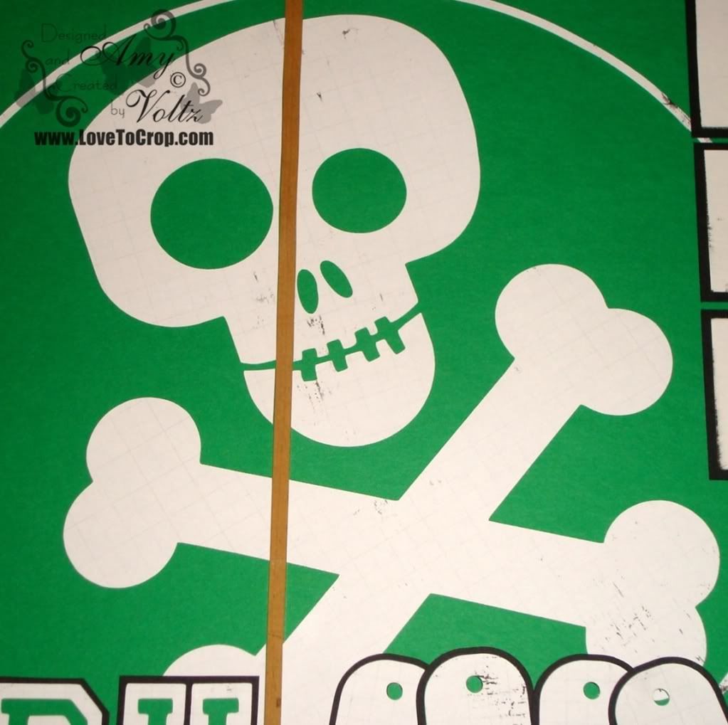
The class logo is that fun skull and crossbones... Cuz of course you think of DEATH when you think of Boot Camp Class, right??? This skull can be found on the Mini Monsters Cricut Cartridge... The image is cut at 17.5" (in proportion to the headstone it goes on -- RDS would be 8.5".
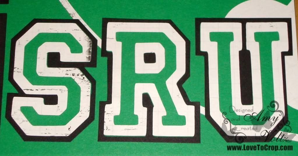
The SRU was cut from the Varsity Letters Cricut Lite Cartridge at 2"... I've been wanting to cut some letters with this one -- I was super excited to use it for this (as that REALLY does look just like the SRU logo!!)...
And 'Boot Camp' was cut using the Dog Tag Feature on the Base Camp Cricut Cartridge. I wanted to thread a chain through the top of the dog tags, but I couldn't find any to use (yet!). Since that's an addition I definitely want to make to this page, I only lightly adhered the tags (so they can be pulled up and re-attached).
I hope you've enjoyed my Green & White (and more) pages... Your comments are always welcome and appreciated... Remember, there is still a little more than a week to enter my Fantastic Follower Giveaway -- Don't miss your chance to WIN a BRAND NEW CM Stork's Delivery Cricut Cartridge!!
Thanks so much for stopping by!! Until next time, may your grass be green and your fairy visits be a delight!! :)
Here for a Hop or GIVEAWAY??? Use these QUICK LINKS to find the right spot fast!! :)
Subscribe via email
Subscribe to:
Post Comments (Atom)






























16 comments:
I love them both Amy but I prefer the fairies (mostly because my house is over run by girls) but I do love all the pics that fit onto the second! It is pretty cool too! Good luck with the challenge!
I'm with Amber! I love them both but I love the boot camp, because my house is a boy zone! Love the bold green!
Amy, once again your LO's are Amazing! I love visiting to see what you have designed. Love the fairies and the boot camp LO. The colors are awesome. I love that Varsity Lite cart, but have only used it once. I must revisit it. Thanks for stopping by.
I'm a fairy girl myself and having too girls they would love this latout. Thanks for sharing at Lasting Memories.
Hugs Ali x
Awesome layouts. The fairy LO is so pretty, and I love the way you made room for the less detailed pics. I actually did that too on my LO I posted yesterday. Just lined them up at the bottom, on both pages. TFS
(: (: SMILES :) :)
Robin aka thecricutscrapper
These are beautiful! I love all that green! Thanks for joining us at Lasting Memories.
Lauren
Both layouts are fantastic ~ i am a new follower!
Carol
http://caroleesscrappinspot.blogspot.com
Great, great layouts. The fairies are awesome!! I love how you did the title on the second page! Great work!
Laurie
I love the layouts you rock these. love and hugs
I love the fairies LO!
Tisha
Hi Amy! These LO's are gorgeous. Love all the green and that fairy is adorable and love the story you shared. TFS and joining us at Lasting Memories!
They are so different and both so amazing. You da scrapper!
That fairy LO is so cute...but I have a thing for fairys! Beautiful
TFS!
Kathie
Kathlee154atgmaildotcom
http://kathleessnippitsncricuts.blogspot.com
Ohh Gosh, I love both of these layouts. Thanks for sharing
Trish
krazykcrafters at msn dot com
Totally Love your Fairy Layout!! Very Nice!!! TFS!!!
http://ibecircled.blogspot.com
ilovetonkinese2 at hotmail dot com
Rexann♥
I love the colors on these layouts, but I specially like the fairies one.
jonder@frontier.com
http://julianaspapercrafts.blogspot.com/
Post a Comment